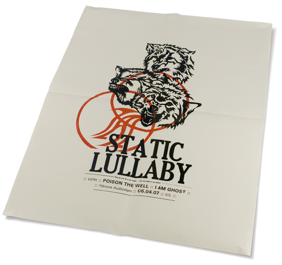
The Wolves poster was probably one of my favorite student projects. It was a piece that helped me fall in love with letterpress, a class I recommend all design students take. Although the process took way longer than originally anticipated (as are 99% of all projects), the time put in was well worth it.
1. Finding Inspiration
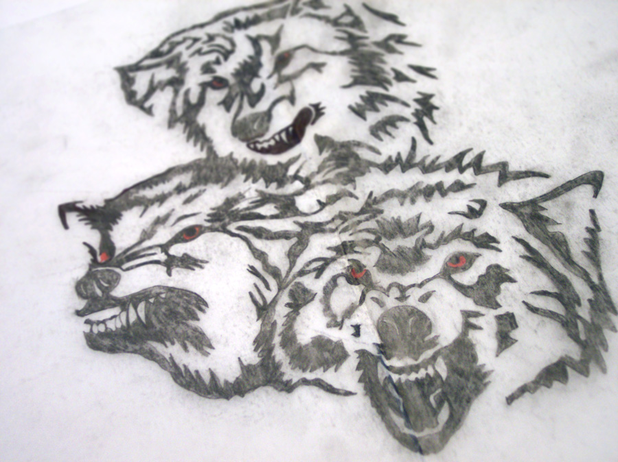
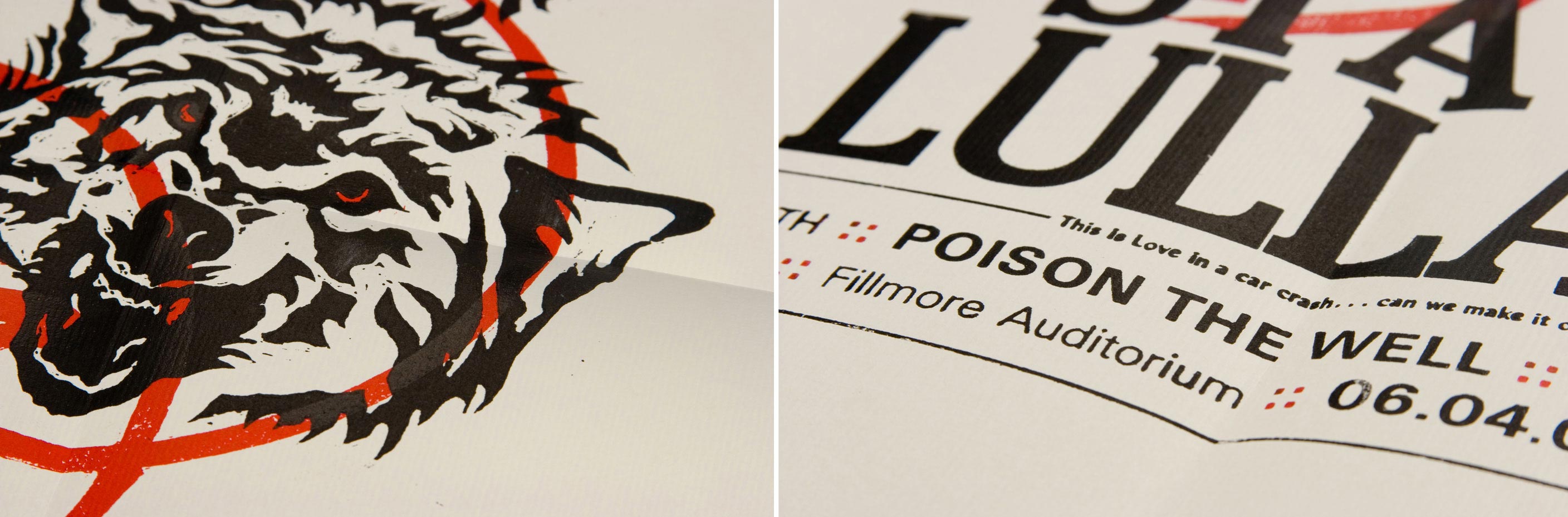
I pulled the lyrics, “…the wolves are coming out tonight,” from the band’s third cd which I thought was a perfect representation of the kind of music they play. This also painted a clear visual in my head and gave me some direction to work with.
2. Drawing And Carving
I hand drew the wolves on paper reading the right way (Click images to open a full preview).
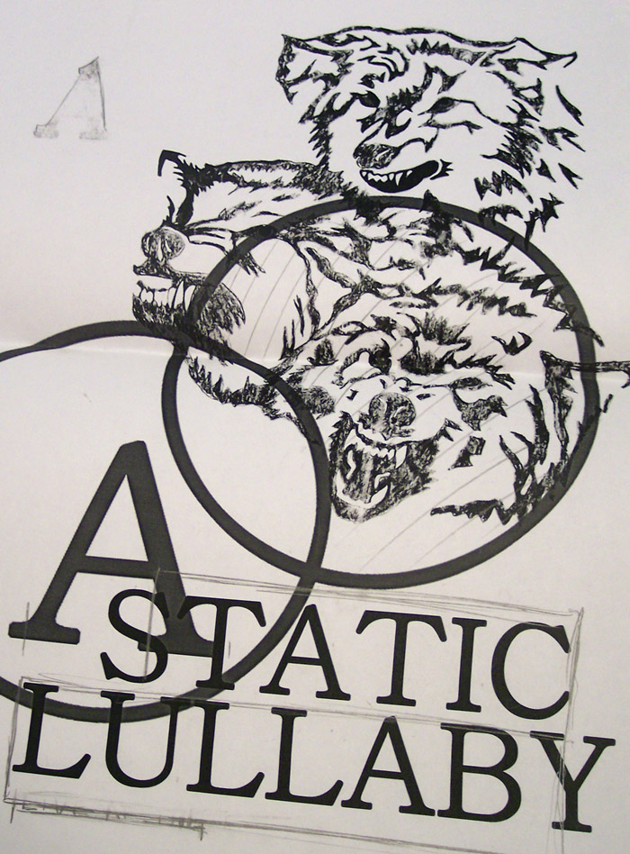
When I was satisfied with the illustration, I scanned it and roughly laid out the type.
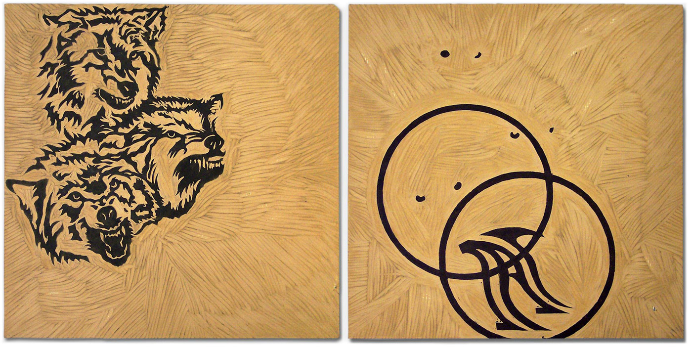
Once I had a better idea of how the type and the illustration were going to work together, I lightly taped black carbon paper to the clean linoleum block. Since I knew I was going to want two separate illustrations to register (line up) on the press, I made sure the linoleum blocks were cut the same exact size.
With carbon paper attached, I traced over my original illustration. When I removed the carbon paper, it left a light outline of the wolves on the linoleum and ready for me to cut (Left Image). On the second block (which was eventually going to be inked in red), I carved the eyes of the wolves, two circles, and a stylized letter ‘A’ (Right Image).

These are the tools I used to carve the blocks.
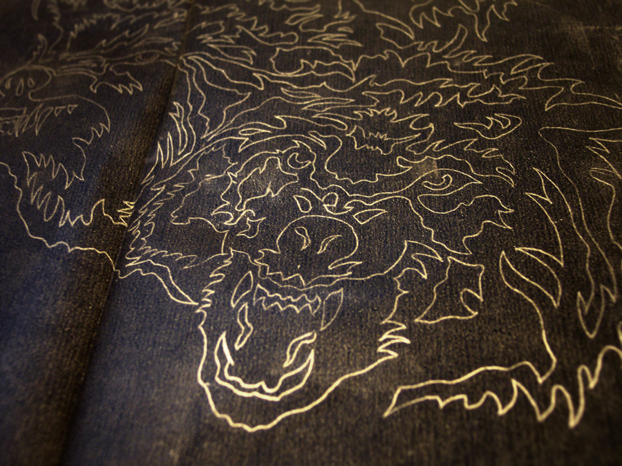
This is an image of the carbon paper after tracing the wolves onto the linoleum blocks. I used a light behind the paper to better show the lines.
3. Printing
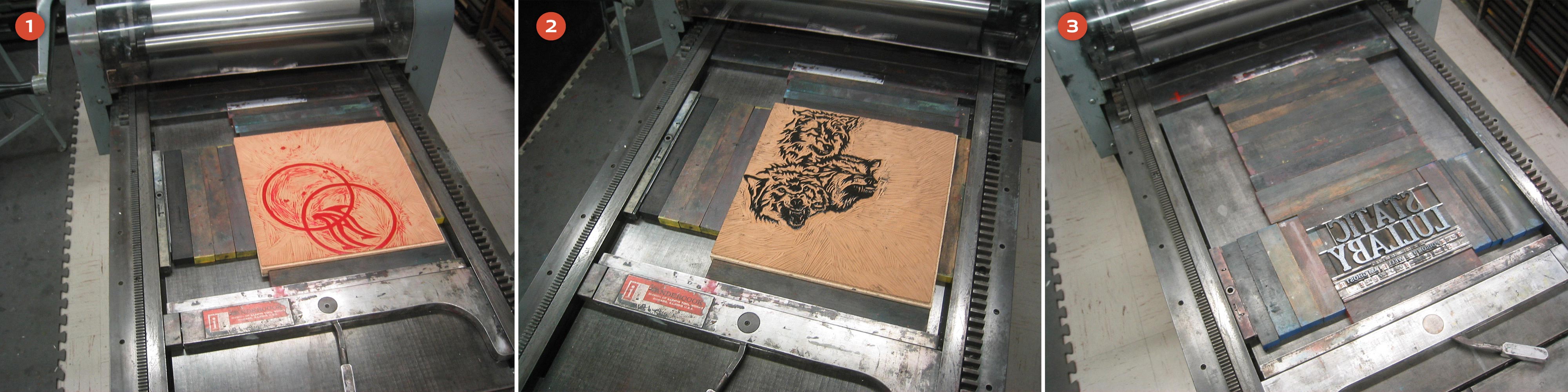
Since I wanted the red eyes to sit behind the wolves, this block obviously needed to go on the paper first (1). Once the red was printed, I easily swapped out that block for the wolves illustration (2). This transition was easy because the linoleum blocks were the same size and they were already registered in the press bed. After both linoleum blocks were printed, I moved onto the type (3).
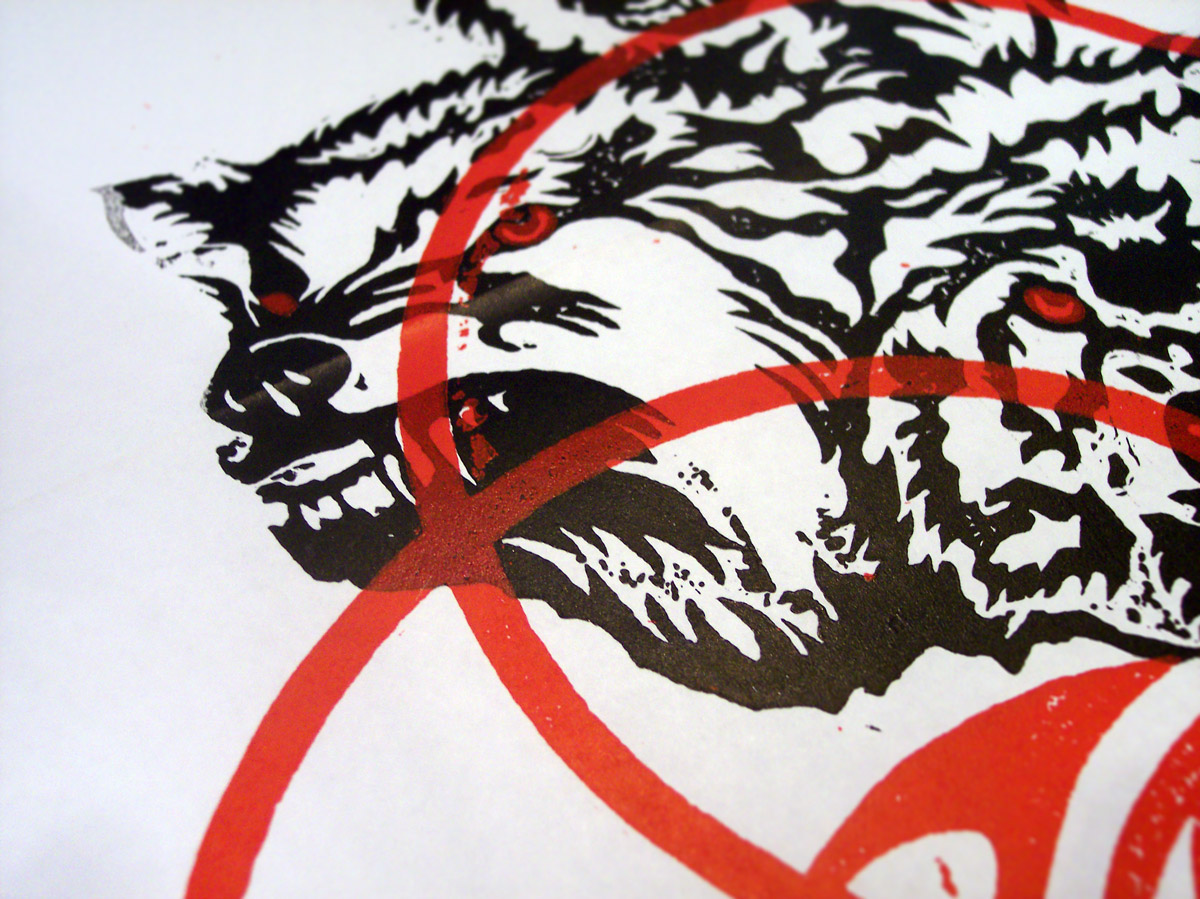
This is an image of one of the first test prints that I made with the blocks. This example shows the red layer being printed last and since the red ink is slightly transparent, it looks very strange over the black (Remember to click the images to enlarge to see all the details).
4. Setting Type
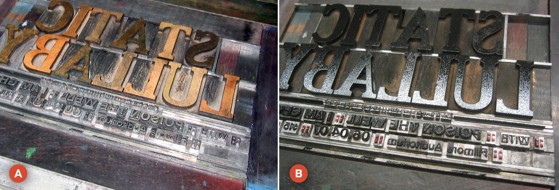
Of course, one of the more tedious (and enjoyable) things about letterpress is actually hand-setting type. Image (A) shows the type I set without ink and image (B) shows the type with ink. Notice that in image (B), the colons are red, but the rest of the type is black. This is not the right way to ink type. The proper way would have been to print the red and black type on two different runs. I was a newbie (and very impatient) so I used an eraser to hand ink the red. In the end, this probably was more of a pain than to just have set the type to be printed in two different runs… oh well.
So there you have the process in a nutshell. A giant mess and about a billion hours later, I had 14 prints of The Wolves poster. The poster was chosen and published in AIGA Kansas City’s A4 Design Awards Book.
Be sure to post your comments and feedback… I love hearing from you all!
Leave a Reply