Design has the power to inform, connect, and shape the way we experience the world. From the spaces we inhabit to the products, media, and environments around us, design is everywhere.
Kansas City Design Week celebrates that influence while bringing together the many disciplines and people that make up the city’s talented creative community.
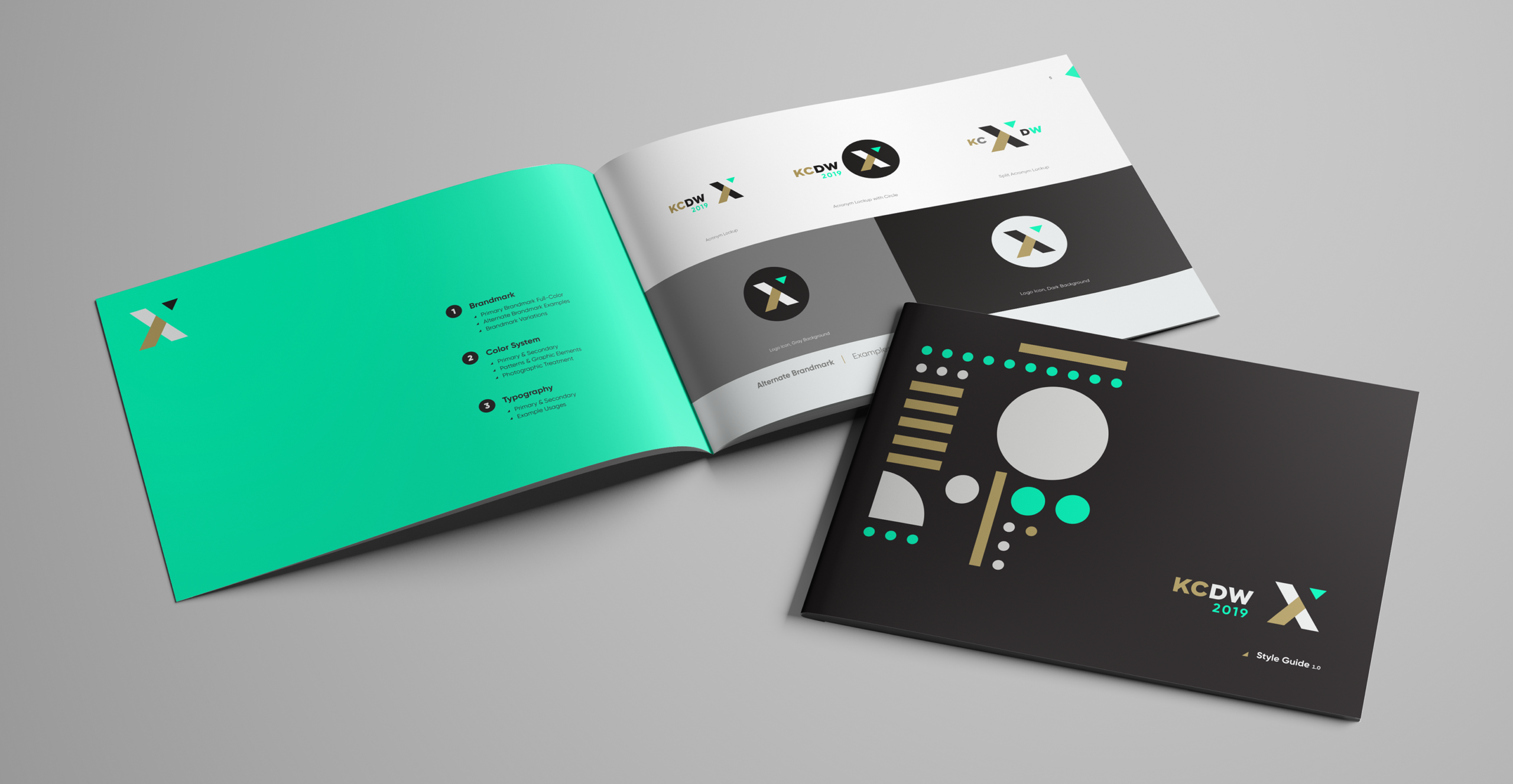
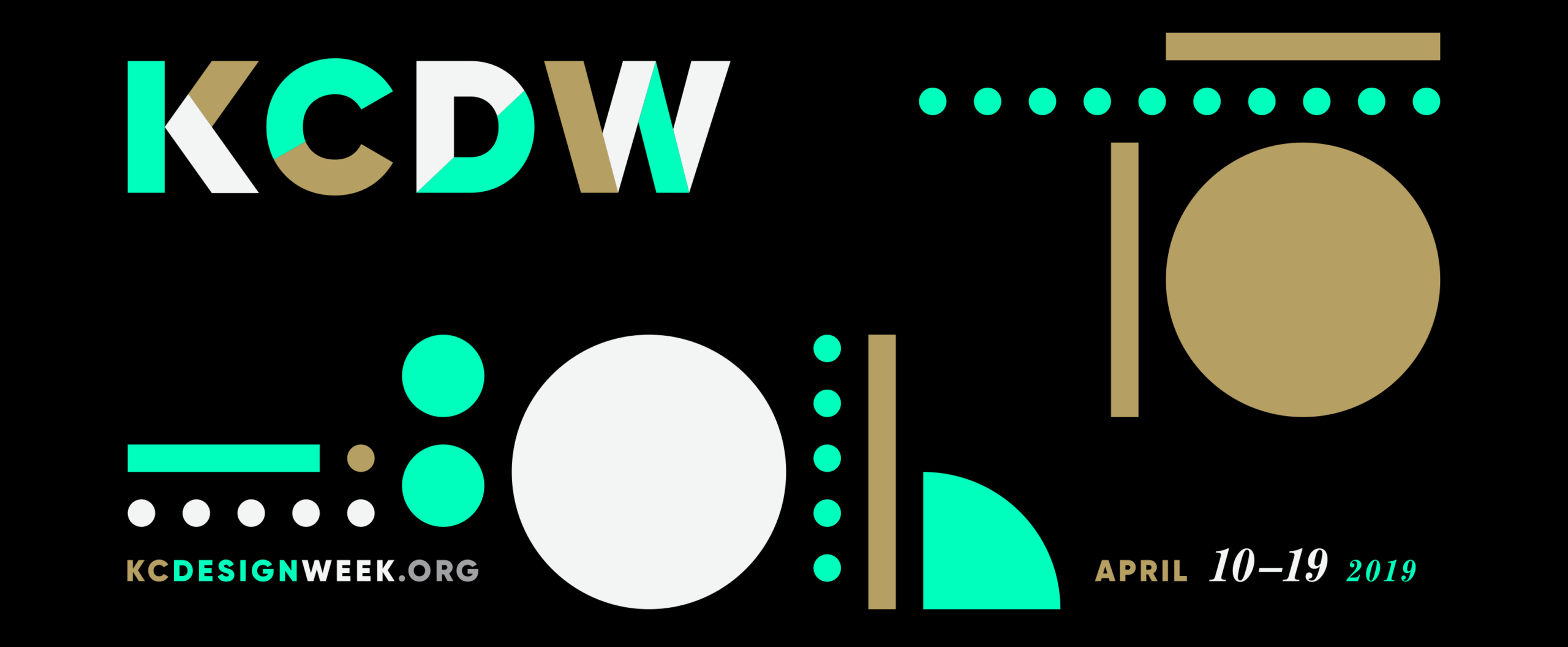
Created in support of AIGA KC, AIA KC, IDSA KC, among many other organizations, the identity was built around a simple idea: good design begins with the fundamentals. Basic geometric shapes became the building blocks for a flexible visual language that could continually shift, combine, and evolve.
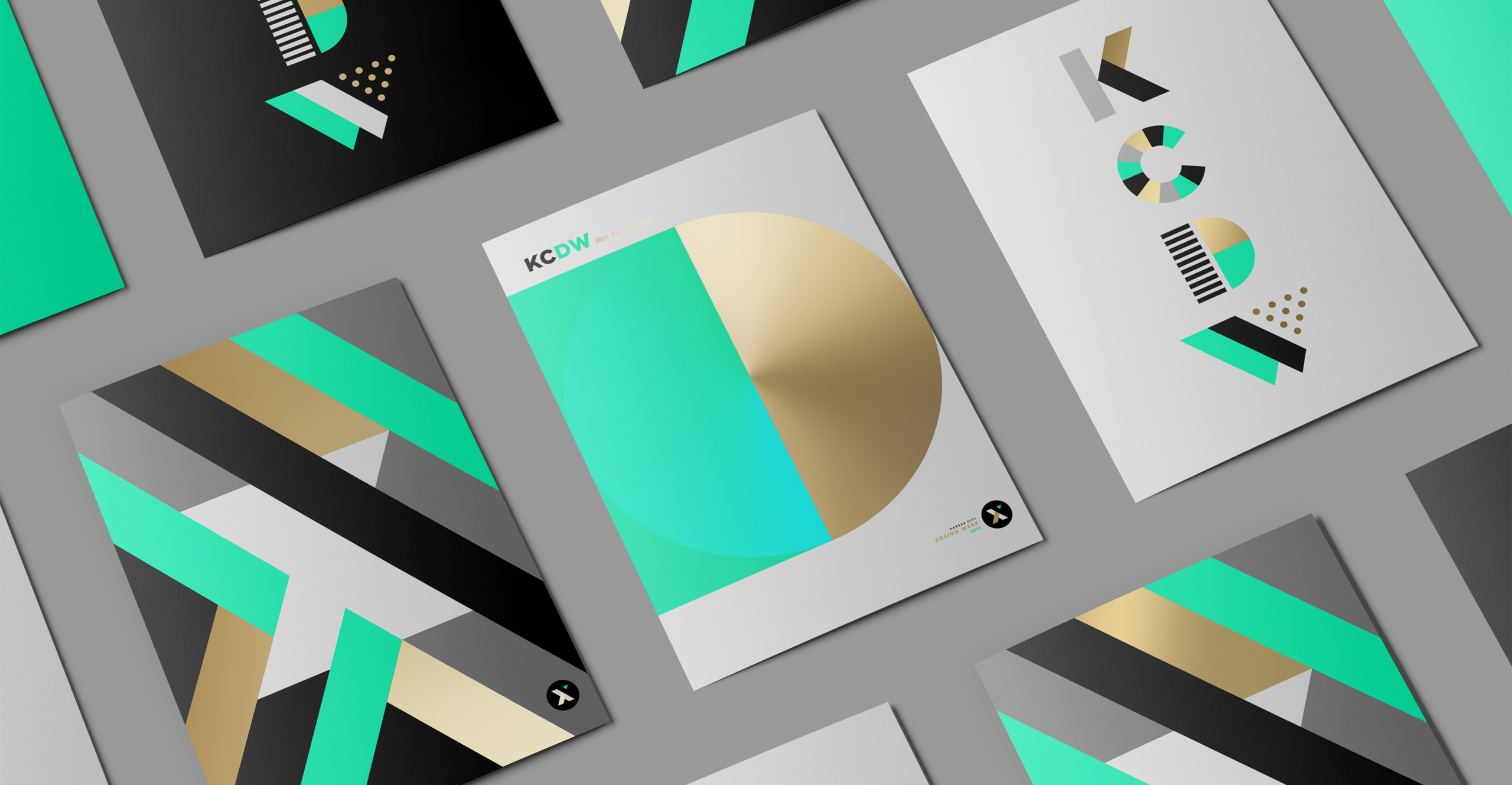
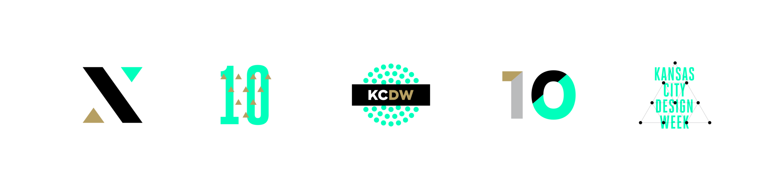
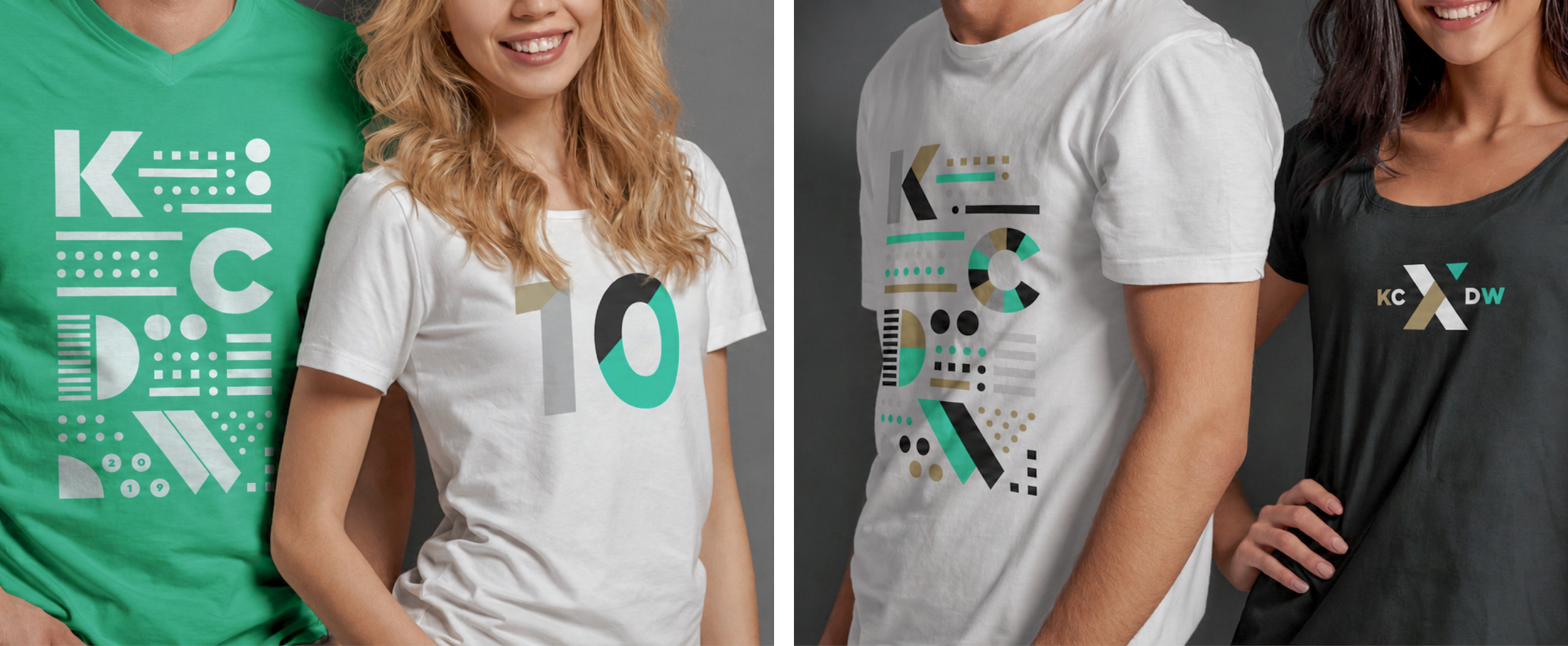
Principles of proximity, closure, similarity, and symmetry were used to transform those simple forms into letters, numerals, icons, and abstract compositions. Each arrangement could take on its own personality while remaining unmistakably part of the same system.
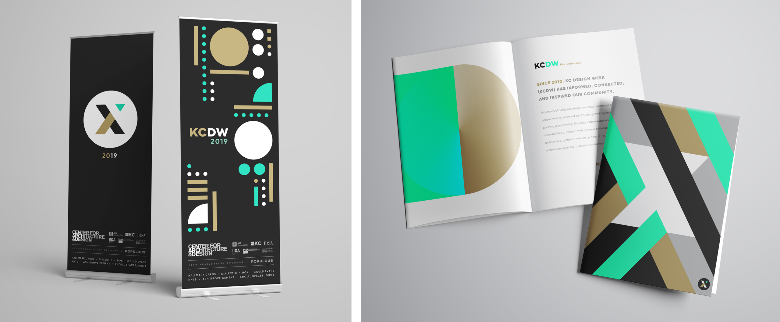
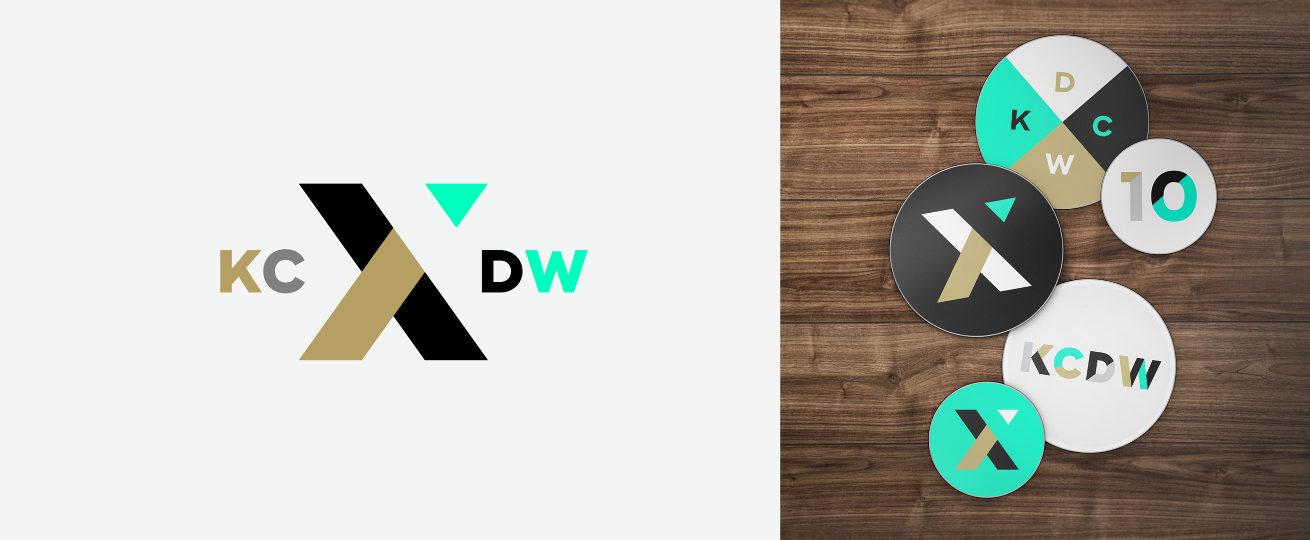
A restrained palette, bold typography, and strong geometric contrast gave the identity a clean, modern character. The modular system could expand across event promotions, signage, publications, apparel, and digital applications without relying on a single repeated graphic.
The result is a visual system that reflects the breadth of design itself: simple elements coming together to create something greater than the sum of their parts. Adaptable, expressive, and constantly evolving, the identity gave Kansas City Design Week a cohesive framework for celebrating creativity in all its forms.