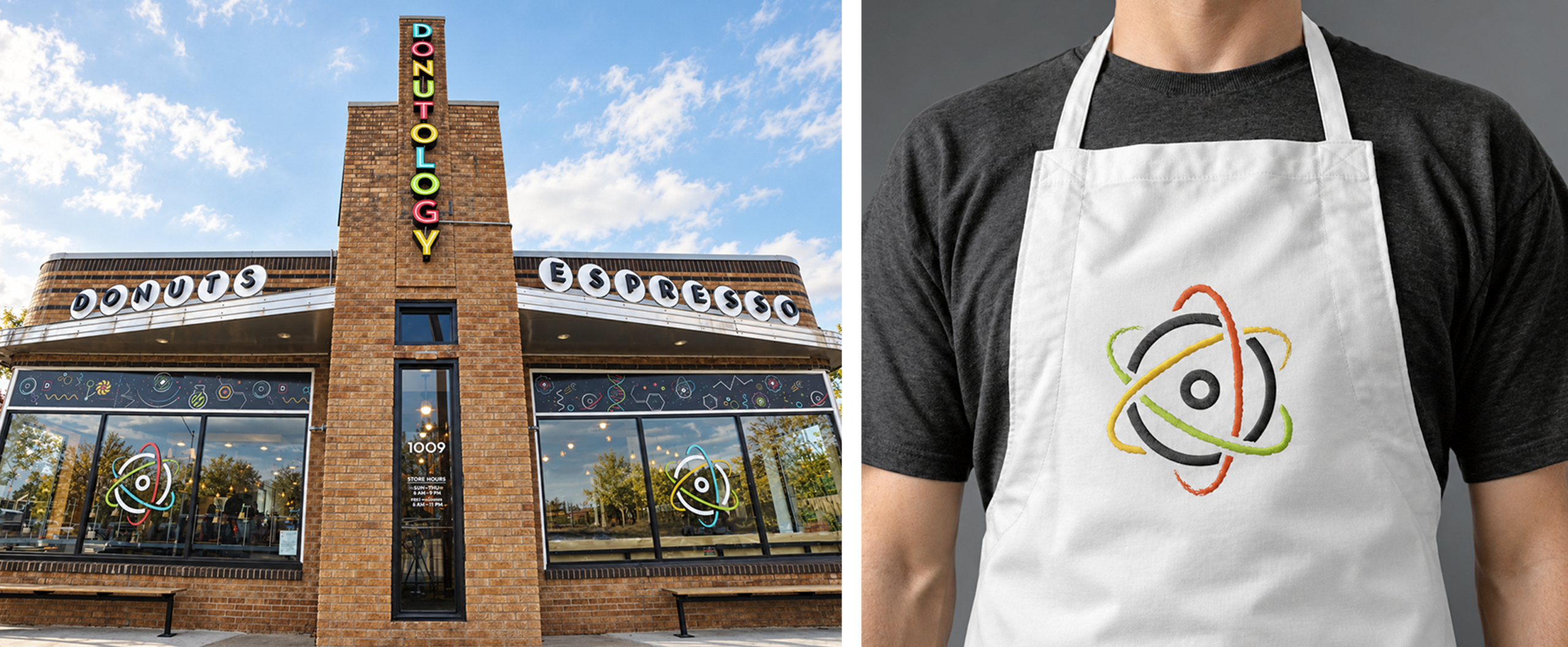
Donuts are inherently fun. Donutology takes that idea to a quantum level, approaching them with the curiosity and experimentation of a (yeah!) science. The brand was built around the idea of a donut laboratory — a place where flavor, creativity, and imagination come together to create something unexpected.
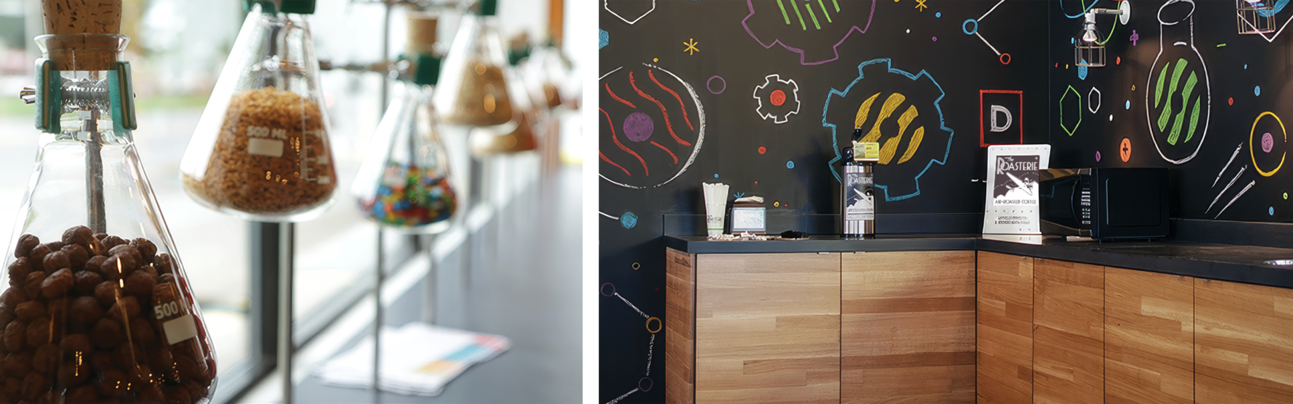
The name itself provided the foundation for the visual concept. By embracing the “-ology” of Donutology, traditional scientific imagery was reinterpreted through the world of donuts. Atomic structures, molecular diagrams, laboratory glassware, and formulas become playful expressions of ingredients, flavors, and experimentation.
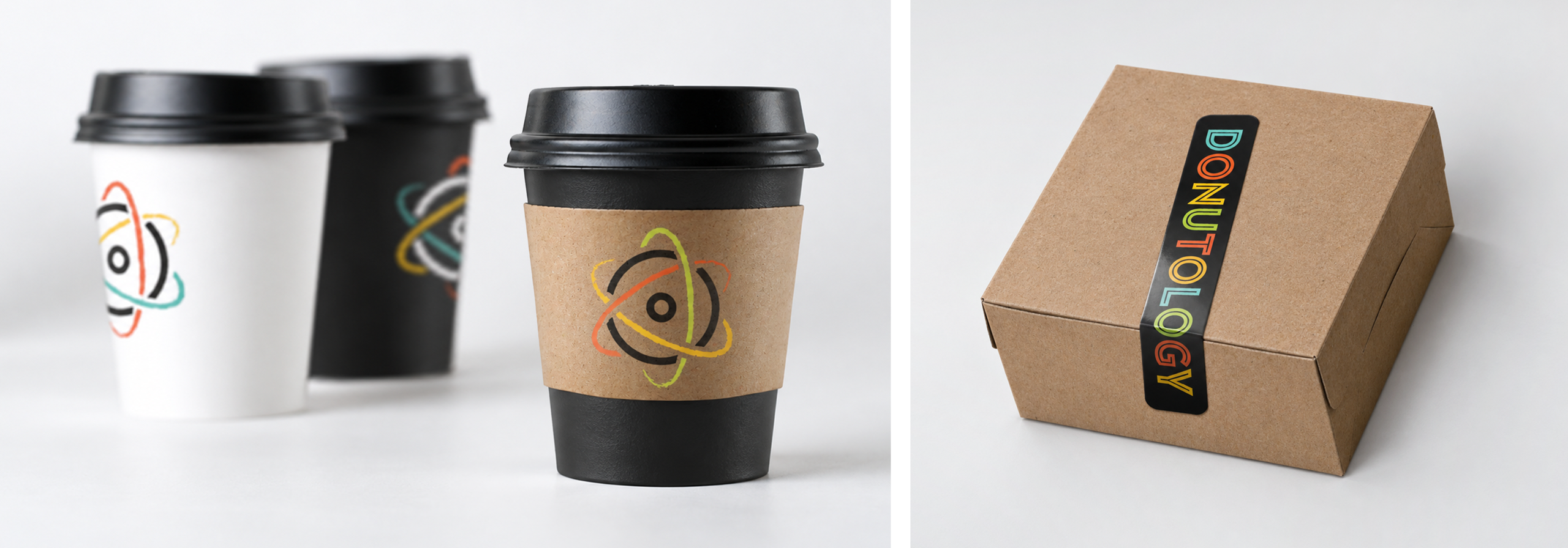
At the center of the identity is a mark that combines the familiar shape of a donut with the orbiting forms of an atom. A bright, eclectic color palette adds energy and personality, while black, white, and natural materials provide a neutral foundation that allows those colors — and the donuts themselves — to stand out.
The visual language extends throughout the environment and brand experience, from packaging and apparel to signage and the physical space. Laboratory vessels become ingredient displays, hand-drawn diagrams transform the walls into an evolving chalkboard of ideas, and scientific references are woven into unexpected details throughout the shop.
The result is an identity that turns buying a donut into something more experiential: one part discovery, one part experimentation, and all parts entirely playful. It gives Donutology a distinctive world of its own — one built around the idea that there is always another combination, flavor, or formula worth exploring. And sometimes that exploration isn’t even limited to this world. For more information, visit Donutology.