About a month ago, I left Willoughby Design to join the creative people at Barkley. The last month has been extremely busy (hence the lack of posting) but now that I’m settled, I can share some new work.
Probably one of the quickest turn-around projects I have ever worked on was to redesign the door clings that Barkley has installed in their elevators. The project came to me at lunch on a Thursday and was out of my hands and into production at 10am the following Friday.
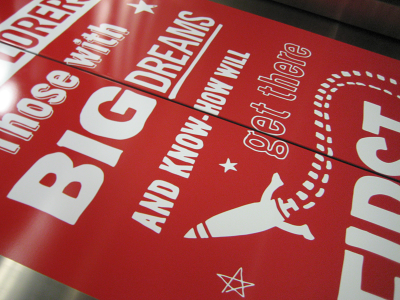
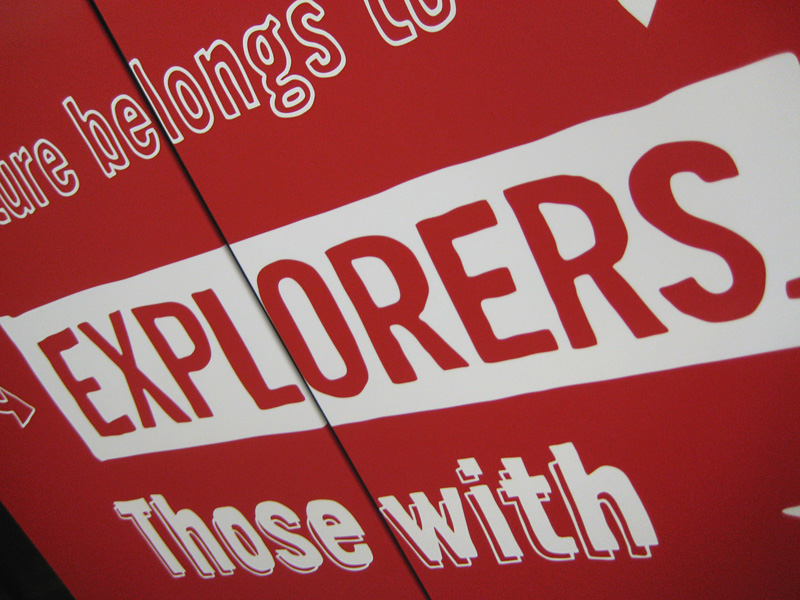
The original design was simple and clean so they wanted me to try a couple different directions. The tricky thing was to design the type so that no letters were split by the door. As you can see with the original design (Below Left), it makes for some pretty inconsistent letter-spacing and kerning. I came up with a few options, some similar to how it was and another to be a little more playful and fun (click images to see more detail).
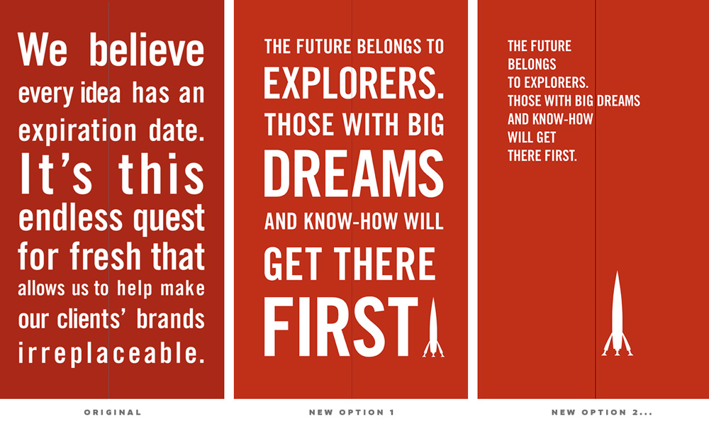
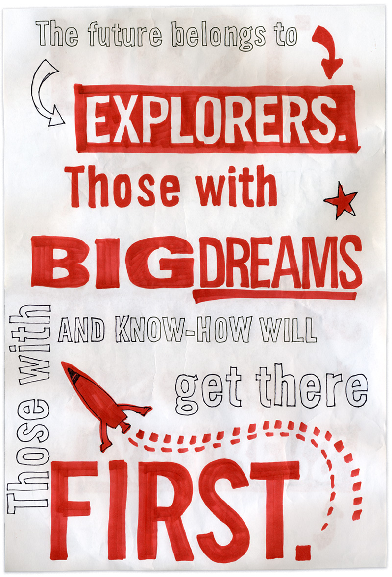
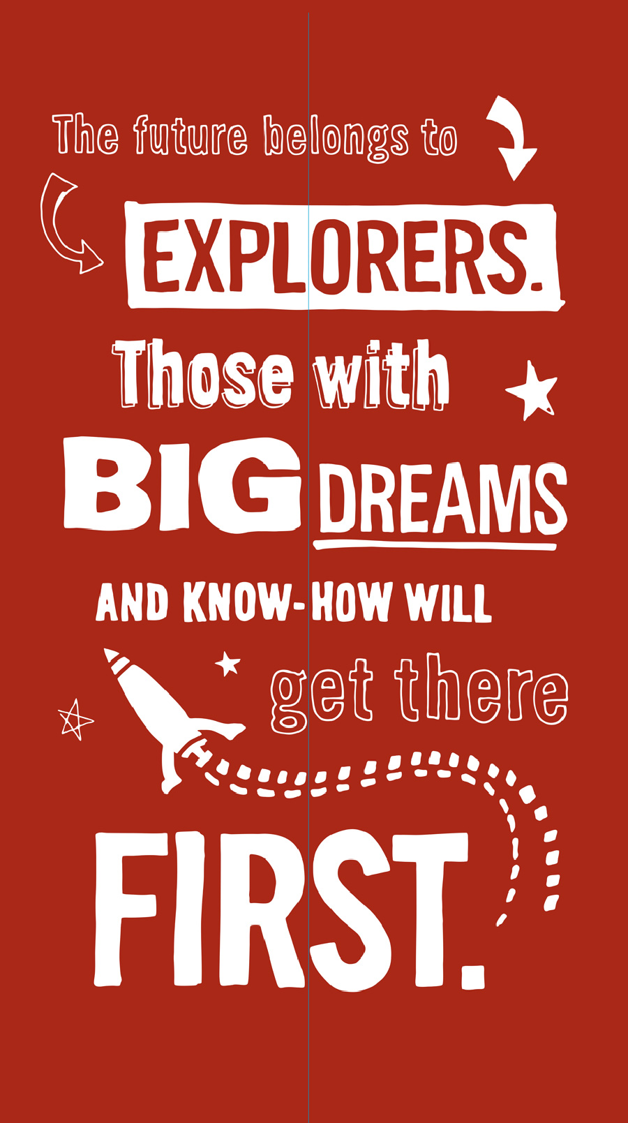
I decided that hand drawn type would have that playful and energetic feel so I roughly laid out the type, printed it out fairly large and with various sharpies and other markers, I traced over my original design. Pictured below is the design as I originally drew it and the final design that was installed.
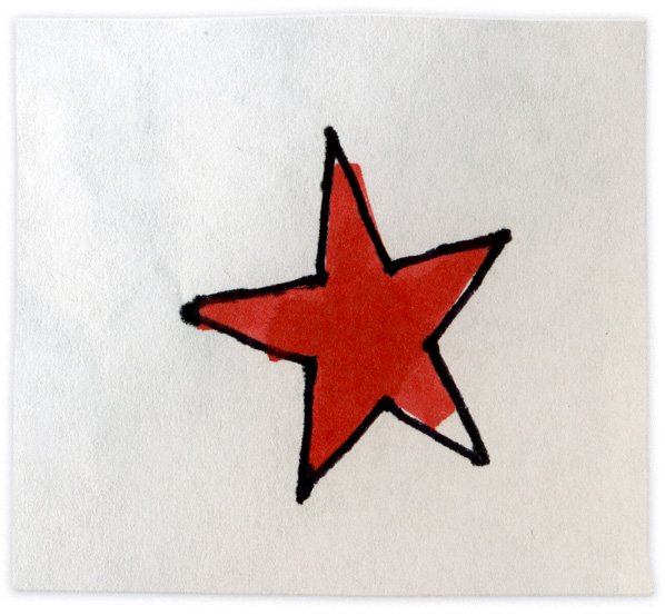
I really like this star…
As I said, we handed it off to the printer on a Friday and it was installed first thing in the morning Tuesday.

Leave a Reply to keli * Cancel reply